Typography Pieces
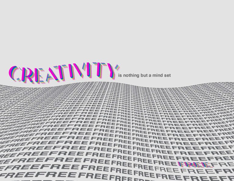
Creativity Quote Piece

I created each of these typography pieces in my typography class at my first college, Palm Beach State College. My professor for this class pushed us to think outside of the box. He was an older gentleman claiming to have seen every type design before and he wanted us to show him something new. This drove me to do some research on new and popular Illustrator art styles. Youtube became my best friend during this semester.
For this piece our class was given the quote “Creativity is nothing but a mind set free” – unknown. Our professor asked each of us to individually design a poster that highlighted the meaning behind the quote and our final piece would be critiqued by the professor.
I taught myself a number of different skills for this project such as the multicolored lettering for the words “creativity” and “free” which can be done with a few simple clicks in Illustrator. I also learned how to create a symbol with repeated typography and distort the shape to create a wave effect and change the perspective.
I think this piece turned out well and is probably my favorite one from this class.
Paige Schubert, Creativity Quote, May 2021, Adobe Illustrator
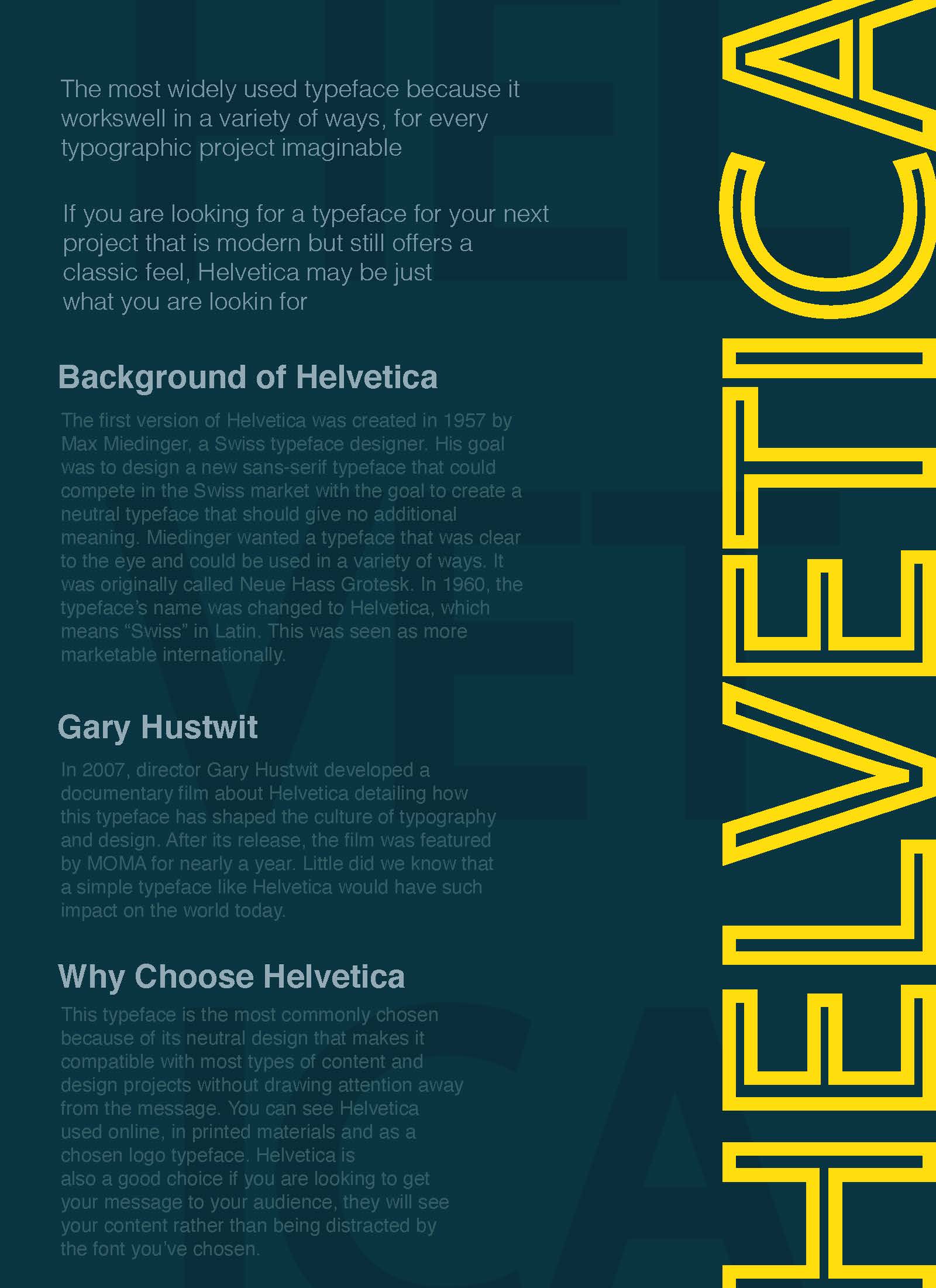
Helvetica Typography Piece

Before starting this project, my class and I were lectured on the typeface Helvetica and how revolutionary this type was. Because of its legibility and many style choices, Helvetica can be used for almost anything and everything. Our project focused on the typeface Helvetica and each student was asked to create a poster dedicated to this font. I chose the colors deciding on yellow and greenish blue. Complementary colors are some of my favorite color choices to use when creating poster works. I used Helvetica type only and added an outline to the yellow type on the far right in Adobe Illustrator. In the background one can also see the word Helvetica written with Helvetica bold type and separated on three columns.
Paige Schubert, Helvetica Poster, March 2021, Adobe Illustrator
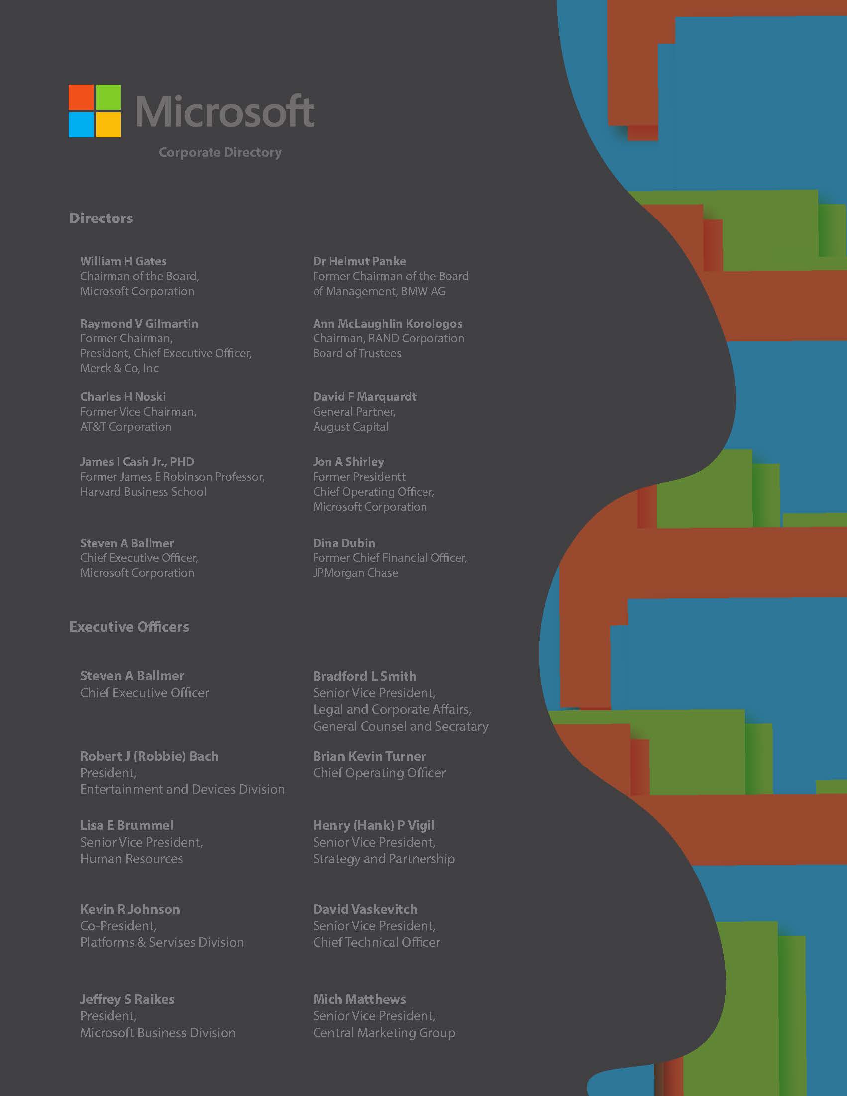
Microsoft Employee Directory Design

This Microsoft Directory was given to our class on a black and white document and blank with only the names of the employees and the logo. Our project task was to individually create a more appealing directory for Microsoft. I chose two grey Pantone colors, a dark grey for the background and a light grey for the type. My goal was to create a piece that was easy on the eyes similar to “dark mode” on a Mac. Then, because the text was flushed left in the template, I added a wave design to the right that I created in Illustrator. I took squares of colors resembling the Microsoft logo and arranged them in a random order. I added a drop shadow to the top most squares adding dimension to the piece. In order to create that wave effect I made a shape with the pen tool and added a clipping mask. Once this was complete, I lowered the opacity on the design because at full opacity, it was too visually distracting and vibrated against the grey background.
Paige Schubert, Microsoft Employee Directory, April 2021, Adobe Illustrator
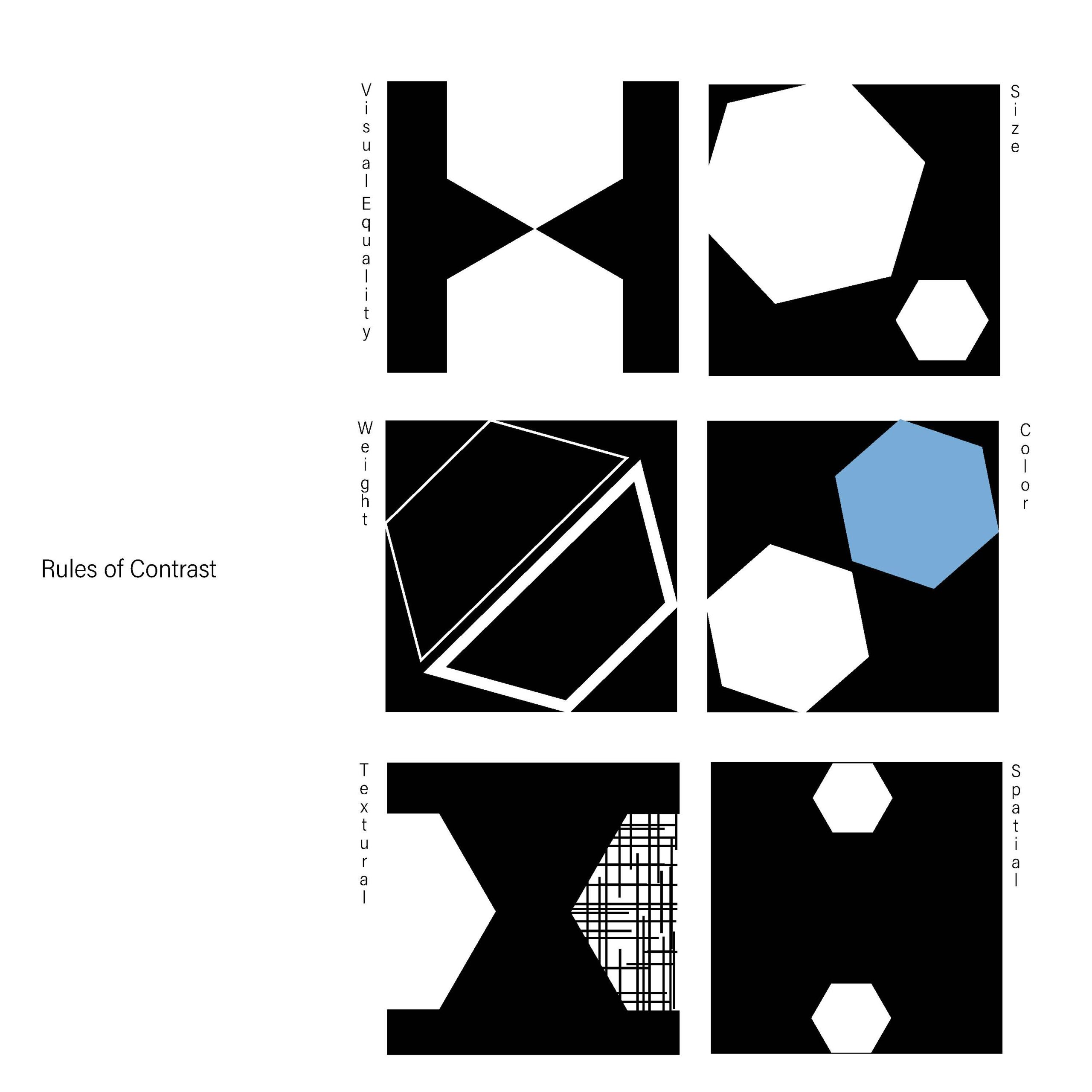
Rules of Contrast Visual

This is one of the earlier typography pieces that I was asked to create in the class. My goal was to create a visual representation of the six rules of contrast which are visual equality, size, weight, color, texture, and space. In order to do so I used hexagon shapes which I made in Adobe Illustrator with the shape tool. While black text on a white background is easiest to read, I decided to reverse that for this project to make it more unique compared to my classmates work. By reversing the colors I allowed the white hexagons to protrude through their given box of space. This project was well received by my professor and classmates and of the pieces I created in this typography class I had the most fun with this one.
Paige Schubert, Rules of Contrast, January 2021, Adobe Illustrator